 |
|
|||||
|
||||||

HTML 4 Tables versus CSS 1.0 Formatting
This week's lecture comes with help from Sergio Villarreal, a Mexican Web-designer who has been active with HTML since 1993 (same time I started). I figured we could use a little south-of-the-border flavor for Cinco de Mayo.
Sergio writes:
"The problem with the Geek Internet was that it was created with geeks in mind. There was no place for background colors and fancy images -- just content. Sweet content. It's hard to argue with that ideal, but the truth is that we all like a little pizzazz in our surfing. Along came the table to solve our dilemma. Finally, we had a controllable way to produce layout! This sealed the deal. We started working out ways to cheat the system. Can't have a solid 1 pixel line? Just throw a spacer GIF, background color and more table cells in there and you're set! Can't control typography? Use another <font> tag! I'd been designing like that for years when CSS and standards came my way. It was different, it was efficient, and it was sexy. I embraced this philosophy deeply and intensely. Here was something that appealed to the coder in me, producing lean, mean code that separated layout from content, while still leaving space for beautiful design. I simply fell in love with it, and haven't looked back since. Until now..."
CSS was blessed as the next big thing when Douglas Bowman redesigned the on-line Wired magazine site, and went from there. In 2003, Zeldman wrote Designing with Web Standards, and we all saw the light. Designers everywhere are embracing this new direction. It's syntactic. It's semantic. It's speedy and lightweight.
Then again, there are a lot of people who still call the transparent spacer GIF image(aka layout shim) their friend. They still work with tables. Some even use the <font> tag. They say it's easier, better supported and faster to develop. Who's right? Is there even a right position to take here?
Sergio took it upon himself to conduct a little experiment to see how things has changed, and if we've ended up the better for it. The results of his experiment are enlightening to code-novice Web designers. Take your time to follow his logic and examples here:
The challenge:
1. Produce a comp for a hypothetical site design in an image editing program.
2. Match the design using HTML 4.01. Make it standards-compliant (because we should have some kind of metric for this highly subjective experiment, after all). Do it with tables. Do it without CSS.
3. Match the design using XHTML 1.0 Transitional. Code for usability and accessibility. Use CSS. Shun tables (unless the design has tabular data).
4. Document impressions through steps 1 to 3.
5. Examine pros and cons. What have we gained? What have we lost? Where do we stand?
Stage 1: Design Your Site
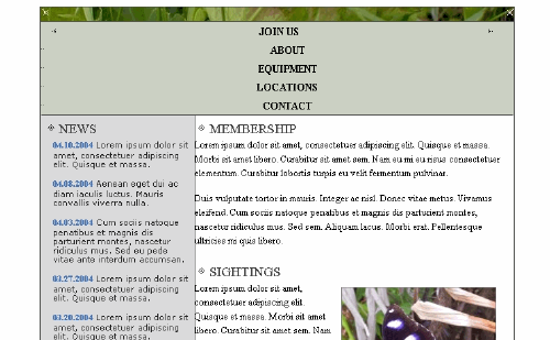
I start out by making the dummy for my design. I'm working for a fictitious group called the Butterfly Watchers Association. They are probably the best client I've had in that they have no input into the design process. Unrealistic though that may be, I'm trying to come up with something that would, indeed, appeal to such a group, so -- stereotyping my target audience -- I go for a conservative layout with classic typefaces.
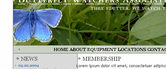
I want this to be a tight little number, effective and to the point. Moreover, I want it to have butterflies. I can't do squat without some butterflies in there, so I start by looking for an image to lead the way. I find it in no time at stock.xchng. The blue butterfly on the leaves practically dictates the site's color pallete. After some cropping, contrast boosting and selective masking, the image is ready to be our header.
The coder in me always forces some accessibility foresight into the design process, so I'm trying to keep images in the end product to a minimum. Hence, after playing around with Garamond Smallcaps for a while, I decide to go with Georgia for the navigation, accepting it as a suitable substitute (worst case scenario: Times New Roman in all caps looks good enough if the client machine doesn't have Georgia). I leave Garamond in the header, though, because the header will be an image, and because I find Georgia's "C" spur downright offensive for this particular part of the design.
I go with Trebuchet MS in a dark gray for the text and Verdana for the news because it looks great in small sizes. There are written and unwritten rules about using four typefaces in the same design. Most of them agree on the fact that you shouldn't, but I'm feeling foolhardy today.
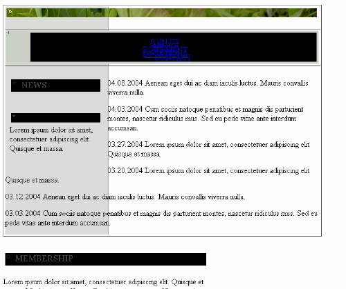
In my extremely limited knowledge of butterflies and the people who watch them, I figure that a Sightings section to highlight rare butterfly spottings would be an interesting thing to mention on the homepage. The group could also use more butterfly watchers, so we'll throw in Membership info. For any sufficiently large organization, a News section is de rigueur too, so I add one. Next, a copyright notice (because client is picky about those things), some custom pixel bullets and ornaments, a snazzy slogan (They flutter. We watch them.), and a two-column layout with horizontal nav under the header, and we've nailed this. To finish off, I highlight the "About" part of the menu to show how the rollover should look. Here's how it looks:

Nice. Now, on to the code...
Stage 2: "Back in my day, we used gajillions of spacer GIFs, and we liked it!"
Once you've been a Web designer for any significant amount of time, and have surfed the Web looking at competitor's designs, you get painfully familiar with the following construct:
<table bgcolor="#ffffff" cellspacing="0" cellpadding="0" border="0" align="center" width="200">
<tr>
<td colspan="3" bgcolor="#545454"><img src="spacer.gif" width="1" height="1" alt=""></td>
</tr>
<tr>
<td bgcolor="#545454"><img src="spacer.gif" width="1" height="1" alt=""></td>
<td width="100%" align="center">Content goes here.</td>
<td bgcolor="#545454"><img src="spacer.gif" width="1" height="1" alt=""></td>
</tr>
<tr>
<td colspan="3" bgcolor="#545454"><img src="spacer.gif" width="1" height="1" alt=""></td>
</tr>
</table>
In table-speak, that's a box. Get used to it, because that's our basic building block. All the usual suspects are there: spacer GIFs, gratuitous use of table attributes, forceful specifications of width attributes and colspans. There's something to be said about this box: it's solid. They don't make 'em like this anymore! This baby could be the poster boy for downwards compatibility! No puny CSS box will stand up to the kind of abuse this guy can take from browser rendering engines...
Here is a blow-by-blow account of the design reproduction process for the design using HTML 4 tables:
Hour 1
Wow. This is almost like going back in time. How did one go about specifying background colors without CSS? Oh, yeah... use the bgcolor attribute. Thank goodness for code-completion. Ok. Make box. Preview. You mean I can specify align=center and this thing is actually centered in all browsers? Well, that was easy!
Tables aren't half bad after all. I feel like I've found a long-lost friend. One spacer GIF and I'm Master and Commander of my own design... Yessir, it's lovely. Work's picking up speed. I like tables!
Where did that ugly whitespace between the header and menu come from?

I didn't put that there! Oh, yeah... Explorer's rendering engine does that when there's whitespace in the code after images.

Ok. Remove the whitespace in code... that was easy.
Hour 2
How long has it been since I've used JavaScript to make a rollover? Max Schreck would definitely look better when carrying that coffin without all that stop motion jitter... Oh well. Let's do it for historical accuracy.
<td ... onMouseOver="chBg(this);" onMouseOut="chBg2(this);" >...</td>
As for the JavaScript:
function chBg(obj) {
obj.bgColor = "#E1E5DB";
}
function chBg2(obj) {
obj.bgColor = "#CBD1C3";
}
That'll do it.
This is coming along quite fast, considering I was a bit rusty. I wish I had a better way of manufacturing padding than nesting tables, though. This code is starting to look a bit complicated. I should add some comments so we can find our place in there.
What do you mean I can't eliminate the underline of a link without using CSS? That can't be right! Let's Google for this stuff.
Hour 3
That can't be. How the heck did we make non-underlined links back then? There must be a way!
Hour 4
Yikes. I'm not turning the darned menus into images just because I can't remove the underline. I'm not making a JavaScript redirect just because of this, either. Google hates JavaScript redirects. It loathes them. I'd be making most of the site invisible to robots, and we can't have that. I set the rules for this experiment, so I can break them. Besides, this particular bit of CSS has been around since day one. That's it... let's just put an inline CSS style="text-decoration: none;" attribute in the link, and we have our non-underlined menus. Yay!
Oh, well, we're almost done. And it's nice to see that we can make actual dual columns that stretch all the way down. Take that, CSS! It would be nice to have a way to frame an image that didn't involve using two tables, though...
 |
|||
|
|
|
|
|
|||

With borders turned on:
|
|||
|
|
|
|
|
|||
The First table provides the box for the frame. We need another one inside to provide the padding.
I don't want to tell the Butterfly Watchers that they'll have to pre-format their butterfly pictures with the frame. This will be a changing image, after all.
Just realized I haven't previewed in anything other than Explorer 6 for over four hours. This is going to be ugly... I hit the preview button and everything looks ok in Firefox. That can't be. I launch Opera. Looks great. I had forgotten this! This is beautiful! And it works even in older Netscape browsers!
Hour 5
So... much... code. Keep... losing... place.
While working on the news section, I realize that the <font> tag controls for text size are extremely limited. I just can't get the size to match the one I used in the comp. The <font> tag is evil. It should die.
The text bleed on the news is not achievable without some sort of table chicanery. Padding is the bane again... But it's nothing we can't solve by throwing more tables in there.
I end up inserting more tables around the butterfly image in the text to simulate a float.
Hour 6
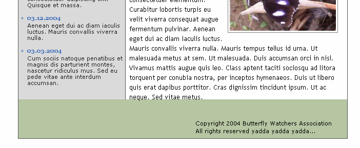
Design is finished. It looks quite similar to the design I was aiming for.
Want to see how many tables are in there? Check this out. View the page source. This is hand-coded. It's as clean as it gets when using tables.
Stage 3: Tables? We don't need no stinkin' tables!
This is it. We'll see what standards-based CSS coding makes of the design. I'll start by marking up the content. I try my best to make this semantically correct (every element should be marked up), and try to avoid extra markup.
The main header is an image, but it is still a header, so I'll mark it up like this:
<h1>Butterfly Watchers Association. They flutter. We watch them.</h1>
I'll worry later about making this display correctly (the ideal here is to think as much as possible about the content and as little as we can about the layout). The other headers (News, Sightings and Membership) will be marked up as <h2>.
The menu is ultimately an unordered list, so it will be marked up as such. Paragraphs won't have classes (we'll use descendant selectors to "hang" them from their containing divs). I'll save a version of the original document and when the design is done, I'll check how much extraneous markup I had to add in concession to the layout (we should strive to avoid that).
The finished document is here. View the page source. It's valid XHTML 1.0 transitional. Notice that all elements have been enclosed in appropriately named <div>s. Dates in the news have been enclosed in <span>s with class "date". As you can see, the code is very simple. We'll try to keep it that way.
Hour 1
Set "container" border to 1px. Have to center the thing. For Explorer, I set text-align: center; to the body style. For the rest of the browsers, margin: 0 auto; (that translates to top=0, right=auto, bottom=0, left=auto) on the "container" style does the trick. Centering the div isn't nearly as easy as it was with tables...
Specifying top and bottom margin in the style of "container" to get the whitespace over and under the design works for most browsers. Explorer screws up the bottom part. How nice.
Adding 20px top and bottom padding to the body instead of margin for "container" works for all browsers. Lovely.
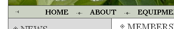
The unordered list items (<li>) must be styled with display:inline; so that the list is displayed horizontally. I add the custom bullets between the elements by specifying 23px left padding on each <li>, setting the bullet as no-repeat background and using appropriate x and y values to position it:
background: url(menuBullet2.gif) no-repeat 4px 9px;
Menu rollovers use the :hover pseudo class of the links. No need for fancy JavaScript here.
To style the header with our butterfly image without compromising accessibility I'll set it as background for the <h1> and use a really big negative text-indent property as shown here. This moves the text far to the left, to take it away from the browser window, and leaves the image in place. The text is still accessible to screen readers and robots. Score one for CSS.
Hour 2
The first item of the menu (HOME) uses a different bullet. I'll have to hide the background (the other bullet) for this item in particular, and replace it with the appropriate bullet. There is a CSS pseudo-class (E:first-child) that targets this element, but support for it is iffy at best. I'll have to settle for adding an extra id (frst) to the first item in the list. That way, I can target it for styling like this:
#hMenu ul li#frst
This kind of thing should be avoided if possible -- modifying document content to account for layout is not a good idea in general.
For the bullet on the other side (CONTACT), I'll use the background of the <ul>:
background: transparent url(menuBullet3.gif) no-repeat 615px 9px;
We can't really have two columns automatically extend to the same height in CSS. Luckily, we can fake it with an image. A simple gray image with a right border will do nicely.
I'll set it as background of the "container" <div> and specify repeat-y:
background: #fff url(bgMain.gif) repeat-y;
So far, we have this.
Hour 3
Making boxes is so much easier with CSS than it is with tables. Having the ability to specify borders separately is really useful.
Time to style the <h2> headers. Bullets are added by the method I explained before (add left padding to the <h2>, set bullet as non-repeating background, position until it looks right).
To make the columns, I just set specific widths to the "sightings", "membership" and "news" divs. I float the "news" to the left and the "sightings" and "membership" to the right. The "copyright" <div> gets clear: both; so that it lands under the floated divs (this is pretty much standard procedure for footers, since floats remove themselves from normal flow of the document).
News positioning involves a bit of fiddling with padding and negative margins.
Having a true float property means we can wrap the paragraph around the butterfly image in the "sightings" section without much fuss. The frame is provided by specifying a solid 1px border and adding padding to the image.
Just noticed a freak rendering error in Explorer: upon first displaying the layout, the copyright section is without border and overlaps the sections above it. Resizing the window restores the border but the div still overlaps the other section. Darn.
This is where we stand.
Hour 4
The rendering error was related to the float:right; of the "sightings" and "membership" sections. Floating them to the left fixes the problem. It's weird, but not completely unexpected.
I'm going to try this for the first time in Firefox. I hit "preview" and, with clenched teeth, take a peek. It's not half bad actually! (This, I find quite surprising). The menu has too much left padding and the bullets are a few pixels off.
It's nothing we can't fix with a bit of fiddling. Here's where we dive headfirst into the ugly reality of CSS hacks.
That wasn't too difficult. A few judiciously applied extra rules fixed it for non-IE browsers. To feed a different value to non-IE browsers, I'm using the !important property, which specifies that that particular rule should take precedence over others for the same element. This is not supported by Internet Explorer.
background: url(menuBullet2.gif) no-repeat 4px 6px !important;

 background: url(menuBullet2.gif) no-repeat 4px 9px;
In CSS, values are read from top to bottom and, if multiple values are specified for the same element, the last one is used. Since Explorer doesn't support !important, it takes the second value, while other browsers take the first one.
It is done. Again, here's the result, but with the internal CSS stylesheet added. Of course, you could make the stylesheet external as well.
Stage 4: Conclusions
On Table-based Design. . .
I've seen that design in every browser I can, under Linux, Windows and Mac platforms, and it looks practically the same. It's rock solid. Score one for the tables.
Then again, that's a lot of code to wade through every time we want to change something in the site. That could be a problem. If a Content Management System (CMS) is used, it will also add extra complexity to the way the content must be formatted -- not exactly user-friendly.
I think it took me this long to whip out the design because I was very rusty on the methodologies involved. If I had to do it again, I'd probably cut that time by one or two hours.
I would describe the experience of working with table-based design as being a lot of grunt work. I was constantly amazed at the way the design advanced, though. Working with pure CSS-based design, I've become accustomed to breaking up designs all the time and having to trace back my steps to hunt down bugs selectively. I didn't have to do any of that here. I just had to keep pumping tables into the design. Let's see how the CSS fares.
On CSS-based Design. . .
Building the design in CSS felt much better. The immediacy of the changes and clarity of the code made me feel more in control of the process. Whereas working with tables felt like building with lego bricks, with incremental changes, CSS felt more like working with a highly trained professional -- I issued a set of orders and watched as they were carried out.
There are significant savings in bandwidth, too. By placing the styles in their own file and using the same file for the whole site, they would be even more visible.
Keeping the layout information apart from the content also provides all sorts of benefits. In the future, I could redesign this site completely without touching the content, as exemplified by the css Zen Garden. There's also the added value of accessibility. In all likelihood, a screen reader would choke on the table-based design. Robots may find this one better too (remember: Google is your most important blind visitor).
After finishing the design, I tested it in a wide variety of platforms and browsers. Explorer 5.5 and 6 render it great. Explorer 5.0 mangles up the menu, some paddings, and misplaces the header image as seen here.
This can undoubtedly be fixed, provided another hour of tinkering. I won't do it, though. For the scope of this article, I think this is good enough, but if this was a real client, I wouldn't sacrifice Explorer 5.0 support. That would mean hunting more bugs and playing with the design until it's ready. Older browsers do a horrible job of rendering it:
Netscape 4.7x
It's better to use unsupported rules (like @import for Netscape) to serve an unstyled version of the document to those browsers.
Although CSS-based design is really fast when you get used to it, you must spend a significant amount of time getting to know the rules, the box model differences, browser quirks and other theory. This comes through practice and practice only. In short: it's much easier to just use tables. If you want to make pure CSS designs, be prepared to invest time in learning. Even if you're already a seasoned developer, be prepared to hunt down bugs relentlessly, sometimes investing several hours in the process.
Stage 5: Picking a Winner
CSS and standards-based design take the match. One look at the source of each design is enough to make me choose this one. CSS offers multiple other benefits, mostly having to do with accessibility. But, ultimately, this is about me being lazy. If I made this design with tables, and the client contacted me one year later to request changes, I'd tell him I joined the foreign legion and flee the country. If I made it with CSS, I'd give it a shot without thinking twice.