

Class on April 3 2019
Introduction to visual analytics
Students discussed Visual analytics as an outgrowth of the fields of information visualization and scientific visualization that focuses on analytical reasoning facilitated by interactive visual interfaces. Bruce started by discussing weather (short-term trends) in the context of climate (long-term trends), looking at Maarten Lambrecht's popular approach to using radial plots to analyze weather.Radial plots require a requisite literacy, just as any other plot genre (you might not remember when you first were introduced to bar charts or scatterplots), and the power of radial plots increases with exposure and contemplation. Maarten provides an example of visual analytics use of his weather plots:

which become more useful as the design decisions in the plots are studied. The bulls-eye approach to concentric circles help the user with identifying seasons (the closer to the bull's eye, the colder the weather, indicative of the winter or cusp of winter season). The color of the radial line segments reinforces the temperature data. The transparent blue filled circles identify the amount of precipitation during any day. Wind data can also be overlaid upon the plots (with black tick marks or vector arrows) but this image above represents the more typical uses of radial plots.
Bruce then shared his design for using radial plots to do a time a motion study — comparing differences from a hectic year of graduate school (while working part-time in a research lab) to a year of working full-time. He was motivated by the concern he wasn't being as productive during a work stint as he had been in a productive year of graduate school.
Bruce kept a record in a lab notebook every day during 2002, breaking each 24-hour period into a coarse hourly breakdown of time spent between seven categories: work, sport, teaching, study, travel, sleep, and leisure (which captured any time not spent in the other six categories — if eating while working or studying, the time was considered work, otherwise it was considered leisure). It was important that he used the same categories and time allocations 13 years later for the work year analysis. The resulting visual analytics interface he created:
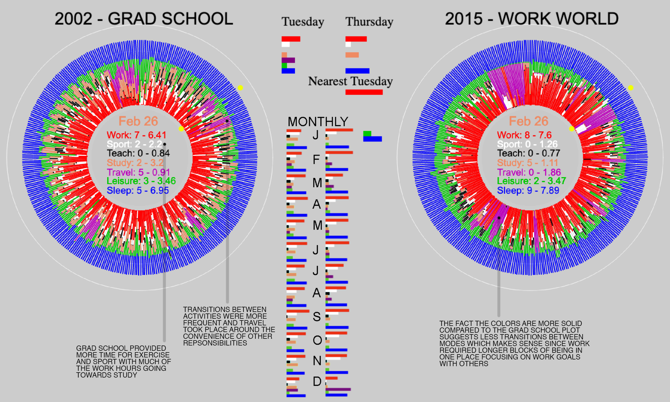
let him interact by day (moving the cursor from left to right moved circularly around the year from the top (January 1) clockwise around a circle to the top again (December 31)). The bar chart at the top compared the exact day of the year and a nearest same day-of-the-week between the two years.
Some of the more interesting insights are presented on the image above, but include the realization the work world was providing an additional hour of sleep and much less study.
Students then played with the live version Bruce provided on his website and mentioned their insights of interest.
The take-home message was that there was a trend in society for capturing personal data and doing analysis — which even exploded with new personal sensors being made for purchase from a wide variety of providers. Personal weather data systems are now popular with The Weather Underground that coordinates shared mapping of weather data worldwide.