

Class on February 27 2019
We started class with a discussion of the two programming/scripting languages we would use for our in-class examples and projects in this course.
You can consider this suggested difference between programming and scripting:
Programming entails writing code to build applications on top of a computer operating system. Knowledge of specific hardware enclosed in the computer or attached as peripherals is useful and at times necessary to program effectively.
Scripting entails writing code using useful programming techniques to create applications (or, in our case, in-browser user experiences), that take advantage of other software on top of the operating system (the web browser, or a python scripting library).
Both require compilation and/or interpretation in order to run. Other code processes include using languages to pass code to a piece of software that reads and presents the code as content. Our work with HTML, SVG, X3D and CSS is best considered code as a content language expression.
We will also be referring to Data Visualization Pipelines in this class. The pipeline is a workflow comprised of steps to create the visualization. Each step can have sub-steps which involve human labor and/or software-based computation. In class we considered a pipeline consisting of steps:
We discussed how some visualization products are used in pursuit of Visual Analytics, which is a specialty field that uses visualizations to be explicitly decision-driven (on different time scales) and consensus-building (in a multi-person use scenario that can include tens or hundreds of collaborators). Visual Analytics became a heavily funded research field after the one-two punch of 9/11 and the Katrina super-hurricane suggested the need for better coordinated visualization products in response to community-wide emergencies (see Illuminating the Path: The Research and Development Agenda for Visual Analytics).
Our first project was to generate a base map from ASCII GRD and ASC files for our local bay and sount: Narragansett Bay and Rhode Island Sound.
Bruce presented a tutorial on setting up the Anaconda package manager in order to set up a Python scripting environment for running Python notebooks via Jupyter software.
As students already had worked extensively with Web development, Bruce provided a simple example of JavaScript development as an extension of HTML, SVG, X3D and CSS development.
Students then worked in teams to recreate basemap visualizations using Python and JavaScript.
Students were asked to grab the Python code from a Python notebook file (to download any file to your local hard drive from the Web via a browser, you can right-mouse click on the link and choose File-Save As to download the file in the intended format of the provider — otherwise, your browser may attempt to show you the file via the browser window).
Things to notice in the notebook:
The first cell in the notebook loads the needed Python packages into memory for use in the following code statements. The statement:
The ri.grd file uses the popular hierarchical, indexed, self-documenting NetCDF4 file format. To read and/or modify it, use the netcdf4 Python package as we set up at the top of our notebook.
Once you load file that is NetCDF4 compliant, you can look at its contents via the variables property:
We then used the Basemap() function provided by the basemap Python package. This created a version of the data in memory that matches a popular projection of spherical data onto a flat presentation.
We use a Python dictionary data strucure to create our own data to decribe how we want to color our basemap. The format is suggested by the LinearSegmentedColormap services we have loaded that the matplotlib Python package (installed by default with the Anaconda initial install) provides. You can Google LinearSegmentedColormap if you want more information on how that code colors a basemap for presentation (and yet, remember, we decided it was easier to use an image and code to extract the dictionary for us (see below).
The last cell in the notebook does its work very efficiently. First, we choose a lighting model for the data presentation, apply shading from that light model, request the creation of a figure in which to place our basemap, add our basemap from above to the figure, and apply a simple color map legend to the right of the geographical image.
Upon running all the code cells in sequence, we ended up the Python basemap result:
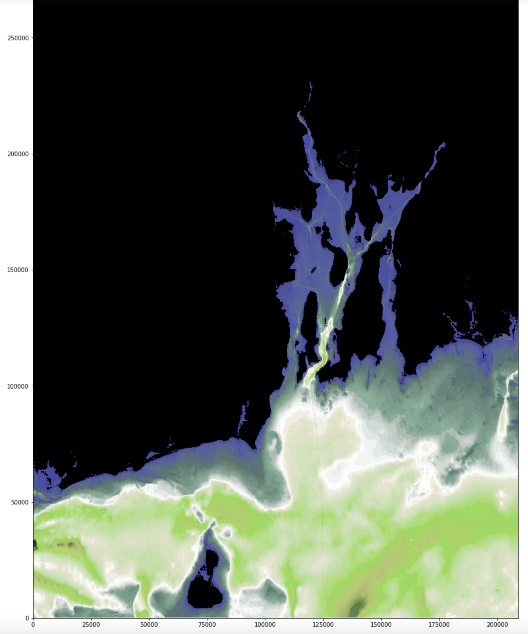
which is a somewhat more professional result that we got from putting the JavaScript code in a text editor, saving it as an .html file, and running it (choosing our ri.asc file to visualize and then waiting for a while for the file to be read (note it is almost 50 megabytes in size), processed, and drawn as an image. If you know JavaScript, you can map the code to our Python approach.
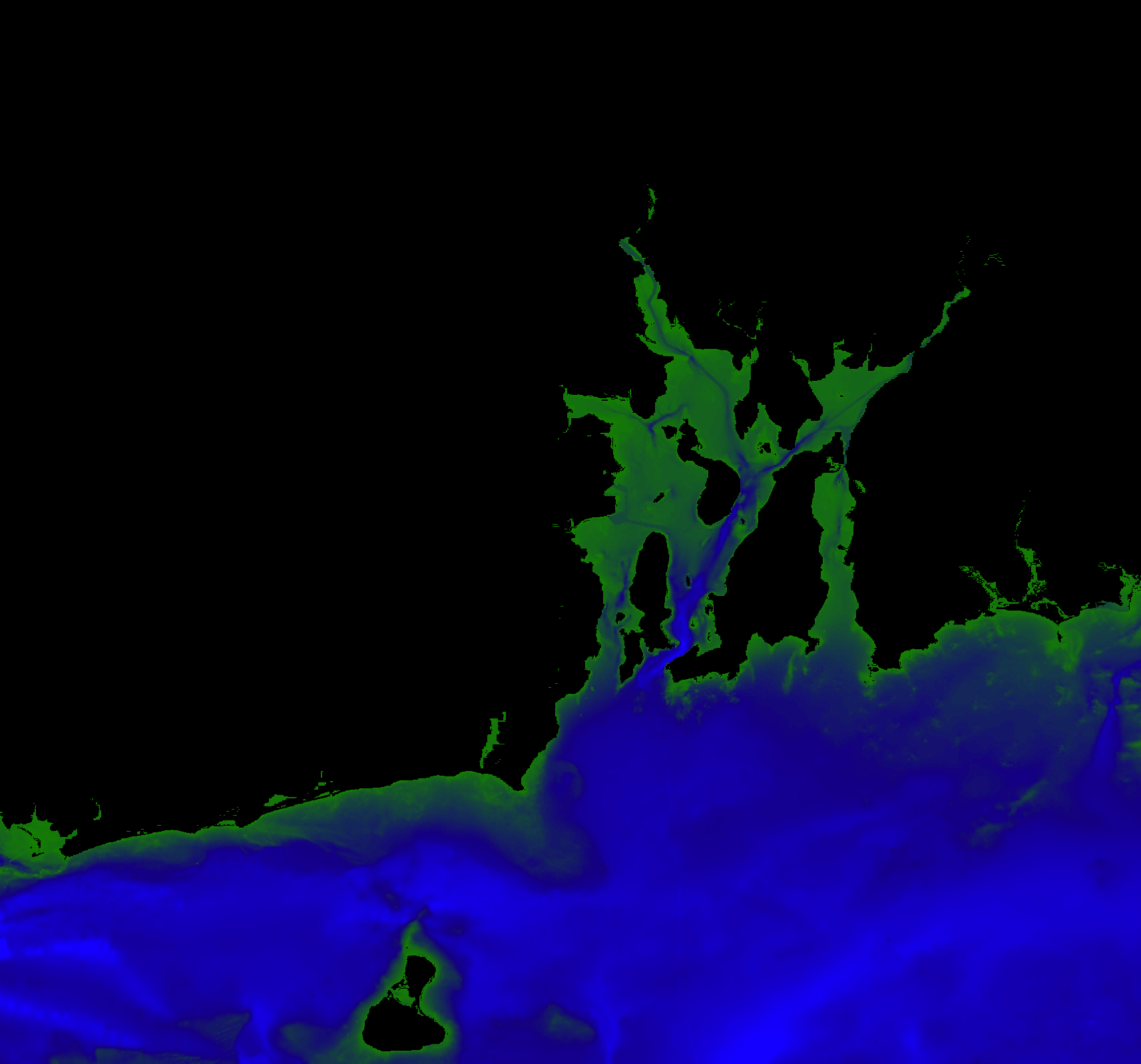
Example of the JavaScript basemap result:
Students discussed the relevant benefits of using JavaScript v. Python:
JavaScript has the benefit of being able to be run in the browser natively, although we might need to add more code to our project to do the more sophisticated features the Python provides. JavaScript allows for a procedural result directly, whereas Python requires we create an image from our result and use either an IMG element or background-image style attribute to get it into the browser window.
Python has the benefit of being able to use the notebook strategy for development and testing as well as of using code services that are mature, tested, and verified by hundreds and even thousands of people on a daily basis. Python has the powerful numpy and matplotlib packages that are optimized for speed and memory use — and the memory use extinguishes when the final image is created and the notebook is shut down (where as JavaScript uses the browser to create an active memory model).
Since JavaScript is the preferred language to learn in the RISD certificate programs, we will continue to look for code to use in the browser that provides the services we decide we like in the Python approach.
We then looked at another approach to color mapping a base map, provided in a week1 file archive.
The change occurs in the second to last cell of the bathy-image-colormap.ipynb notebook:
Students were asked to set up JavaScript and Python development environments on their home development environments (preferably a laptop they could bring to class if possible). We can do it together if they can bring the computer to class next session.
You can consider this suggested difference between programming and scripting:
Programming entails writing code to build applications on top of a computer operating system. Knowledge of specific hardware enclosed in the computer or attached as peripherals is useful and at times necessary to program effectively.
Scripting entails writing code using useful programming techniques to create applications (or, in our case, in-browser user experiences), that take advantage of other software on top of the operating system (the web browser, or a python scripting library).
Both require compilation and/or interpretation in order to run. Other code processes include using languages to pass code to a piece of software that reads and presents the code as content. Our work with HTML, SVG, X3D and CSS is best considered code as a content language expression.
We will also be referring to Data Visualization Pipelines in this class. The pipeline is a workflow comprised of steps to create the visualization. Each step can have sub-steps which involve human labor and/or software-based computation. In class we considered a pipeline consisting of steps:
Collect/Find Data ->
Create a database ->
Populate the database ->
Interact to get data out ->
Computation (aggregation, sort, filter, etc.) ->
Create a visual representation ->
Build a composition ->
Add dynamic interaction ->
Request feedback (critique)
It's often a good idea to use a very good interview/survey specialist when pursuing feedback. The pipeline is generally performed in order but many feedback cycles can be added to iterate upon a better visualization result. The feedback result is often the most demanding step where revisiting other steps is then warranted. We hope to get some exposure to all the steps in our class together.
We discussed how some visualization products are used in pursuit of Visual Analytics, which is a specialty field that uses visualizations to be explicitly decision-driven (on different time scales) and consensus-building (in a multi-person use scenario that can include tens or hundreds of collaborators). Visual Analytics became a heavily funded research field after the one-two punch of 9/11 and the Katrina super-hurricane suggested the need for better coordinated visualization products in response to community-wide emergencies (see Illuminating the Path: The Research and Development Agenda for Visual Analytics).
Our first project was to generate a base map from ASCII GRD and ASC files for our local bay and sount: Narragansett Bay and Rhode Island Sound.
Bruce presented a tutorial on setting up the Anaconda package manager in order to set up a Python scripting environment for running Python notebooks via Jupyter software.
As students already had worked extensively with Web development, Bruce provided a simple example of JavaScript development as an extension of HTML, SVG, X3D and CSS development.
Students then worked in teams to recreate basemap visualizations using Python and JavaScript.
Students were asked to grab the Python code from a Python notebook file (to download any file to your local hard drive from the Web via a browser, you can right-mouse click on the link and choose File-Save As to download the file in the intended format of the provider — otherwise, your browser may attempt to show you the file via the browser window).
Things to notice in the notebook:
The first cell in the notebook loads the needed Python packages into memory for use in the following code statements. The statement:
os.environ["PROJ_LIB"] = '/Users/ceadv/anaconda3/share/proj'is not necessary if your Anaconda installation registered the location properly during install (you can comment out the line by placing a cross-hatch (#) symbol, popularly called a hashtag lately, in front of the statement). Try running the code without the statement or update it to point to your Anaconda's proj directory on your hard drive.
The ri.grd file uses the popular hierarchical, indexed, self-documenting NetCDF4 file format. To read and/or modify it, use the netcdf4 Python package as we set up at the top of our notebook.
Once you load file that is NetCDF4 compliant, you can look at its contents via the variables property:
fh.variablesWe need to know the variable names (lat, lon, and altitude) as well as the bounds of the data in geographical coordinates. For example:
actual_range: [-71.91320801 -70.97058105]which identifies the longitudinal range of the altitude data. The code:
#create an ascii grid .asc file
ascfile = open('ri_grid.asc', 'w')
ascfile.write('ncols 1716\n')
ascfile.write('nrows 2141\n')
ascfile.write('xllcorner -71.91320801\n')
ascfile.write('yllcorner 41.13315883\n')
ascfile.write('cellsize 0.000549637\n')
ascfile.write('nodata_value  -0\n')
for i in range(len(lats)):    # for every pixel:
    if(i%4!=2):
        for j in range(len(lons)):
            ascfile.write(str(bathy[2140-i][j]))
            ascfile.write(' ')
        ascfile.write('\n')
ascfile.close()
Converts the NetCDF4 data to the ASCII grid standard (which we used in our JavaScript example).
We then used the Basemap() function provided by the basemap Python package. This created a version of the data in memory that matches a popular projection of spherical data onto a flat presentation.
We use a Python dictionary data strucure to create our own data to decribe how we want to color our basemap. The format is suggested by the LinearSegmentedColormap services we have loaded that the matplotlib Python package (installed by default with the Anaconda initial install) provides. You can Google LinearSegmentedColormap if you want more information on how that code colors a basemap for presentation (and yet, remember, we decided it was easier to use an image and code to extract the dictionary for us (see below).
The last cell in the notebook does its work very efficiently. First, we choose a lighting model for the data presentation, apply shading from that light model, request the creation of a figure in which to place our basemap, add our basemap from above to the figure, and apply a simple color map legend to the right of the geographical image.
Upon running all the code cells in sequence, we ended up the Python basemap result:
which is a somewhat more professional result that we got from putting the JavaScript code in a text editor, saving it as an .html file, and running it (choosing our ri.asc file to visualize and then waiting for a while for the file to be read (note it is almost 50 megabytes in size), processed, and drawn as an image. If you know JavaScript, you can map the code to our Python approach.
Example of the JavaScript basemap result:
Students discussed the relevant benefits of using JavaScript v. Python:
JavaScript has the benefit of being able to be run in the browser natively, although we might need to add more code to our project to do the more sophisticated features the Python provides. JavaScript allows for a procedural result directly, whereas Python requires we create an image from our result and use either an IMG element or background-image style attribute to get it into the browser window.
Python has the benefit of being able to use the notebook strategy for development and testing as well as of using code services that are mature, tested, and verified by hundreds and even thousands of people on a daily basis. Python has the powerful numpy and matplotlib packages that are optimized for speed and memory use — and the memory use extinguishes when the final image is created and the notebook is shut down (where as JavaScript uses the browser to create an active memory model).
Since JavaScript is the preferred language to learn in the RISD certificate programs, we will continue to look for code to use in the browser that provides the services we decide we like in the Python approach.
We then looked at another approach to color mapping a base map, provided in a week1 file archive.
The change occurs in the second to last cell of the bathy-image-colormap.ipynb notebook:
from PIL import Image
from matplotlib.colors import LinearSegmentedColormap

im = Image.open('62Blb.png') # Can be png or jpg or various others.
pix = im.load()              # Load pixel values into a two-dimensional array
pix_width = im.size[0]       # Get the width of the image - [1] is the height

key = ["red", "green", "blue"]

#leftmost values from image
redlist = [[0.0,  pix[0,0][0]/255, pix[0,0][0]/255]]
greenlist = [[0.0,  pix[0,0][0]/255, pix[0,0][0]/255]]
bluelist = [[0.0,  pix[0,0][0]/255, pix[0,0][0]/255]]

payload = [redlist, greenlist, bluelist]
for i in range(1, pix_width):
    redlist.append([i/pix_width,  pix[i,0][0]/255,   pix[i,0][0]/255])
for i in range(1, pix_width):
    greenlist.append([i/pix_width,  pix[i,0][1]/255,   pix[i,0][1]/255])
for i in range(1, pix_width):
    bluelist.append([i/pix_width,  pix[i,0][2]/255,   pix[i,0][2]/255])

#rightmost values from image
redlist.append(  [1.0, pix[pix_width-1,0][0]/255, pix[pix_width-1,0][0]/255])
greenlist.append([1.0, pix[pix_width-1,0][1]/255, pix[pix_width-1,0][1]/255])
bluelist.append( [1.0, pix[pix_width-1,0][2]/255, pix[pix_width-1,0][2]/255])

bestdict = dict(zip(key, payload))
Here we are creating the same dictionary required of a LinearSegmentedColormap approach, but we are creating the details from an image file named 62Blb.png.
The im.load() method loads the pixel data into a pix variable, which then is used to fill out the dictionary. We will use this code often in class, but students
are not required to understand all its intricacies as syntax — just as functionality so they can use other images for colormapping.
Students were asked to set up JavaScript and Python development environments on their home development environments (preferably a laptop they could bring to class if possible). We can do it together if they can bring the computer to class next session.