Class on March 6 2019
Bruce led a mediated discussion with the students regarding the assigned reading with a focus on providing thoughts
regarding how we see and perceive with our human physiology, how we tend to attempt to order and interpret the information gathered from our eyes in the simplest
possible way (at least as a first cut at perception), how we have an ingrained sense of shape that allows us to make sense of the visual field effortlessly, how
we attend to movement in the visual field, and how we distinguish foreground objects from the general background effortlessly as well. Topics discussed included:
Job #1 of our visual system is to scan our surroundings for what we need for survival: not bump into objects, find food, spot dangers.
Then we gather and interpret the light that reaches our eyes (for additional interesting content). Without our attention, we miss a lot. We can pursue an active exploration — the outpost for our brain. Perception starts here.
Visual structures can be consciously organized and put together — the systematic manipulation of graphic elements and forms influence the way we perceive them.
Suggestion can make us believe we see something we couldn't (e.g. a newspaper headline too far away).
Fibonacci sequence (...3,5,8,13...) seems to align with our ability to notice increases in light (using an experiment of adding candles).
An experience has a quality that is different from the parts — relationships dominate perception (and order matters)
art v. science is commonly simplified to emotion v. intellect, but that reduction is not completely accurate.
The simplicity principle (see the boy in figure 2.3)
We simplify what we see through:
Figure v. Ground v. Depth (figure-ground differentiation is pursued first in our visual scanning)
sense of depth comes from the contrast of figure and ground (more contrast in brightness or hue (or texture or size), the more the depth effect) (important for font design)
chromatic aberration gives the illusion of colors taking up different positions in space, with red being in front, and blue being behind.
vanishing points can invite us in while isometric can suggest we keep out
figure-ground can provide an intense 3-D effect and/or is useful for measurability
Bruce then started a discussion regarding color and how we see it and asked students to suggest relevant notes on color theory:
Hornung's Seeing Color
Tufte's Chapter 3
Zwimpfer's Color Light Sight Sense
Laidlaw's Visualization Viewpoint
Relevant notes from the Tufte reference include:
Humans have been shown to recognize 1,000,000 different colors in contrived situations, but 20,000 is realistic in day-to-day experience.
After 20-30 colors, we experience diminishing returns and even negative returns on occasion. The color brewer is a popular tool for making informatics coloring decisions.
color provides four purposes: to label, to measure (as in charts), to represent, and to decorate
use colors found in nature (especially those on the lighter side) - familiar and harmonic
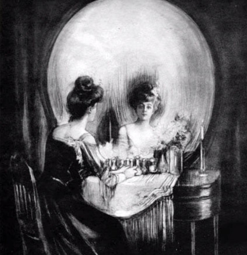
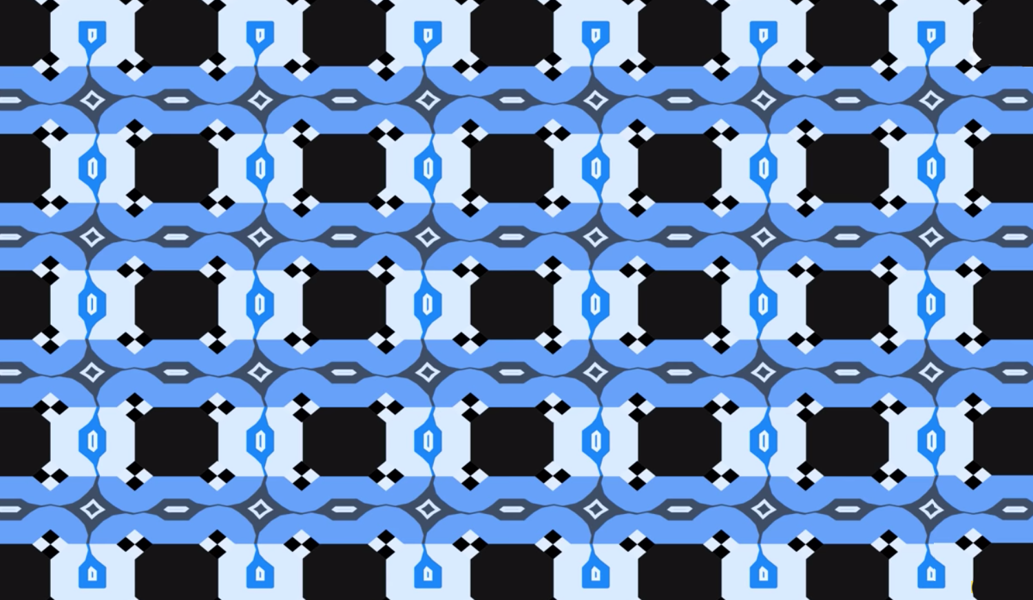
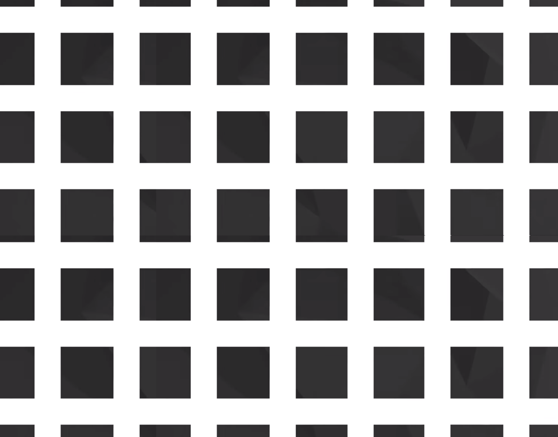
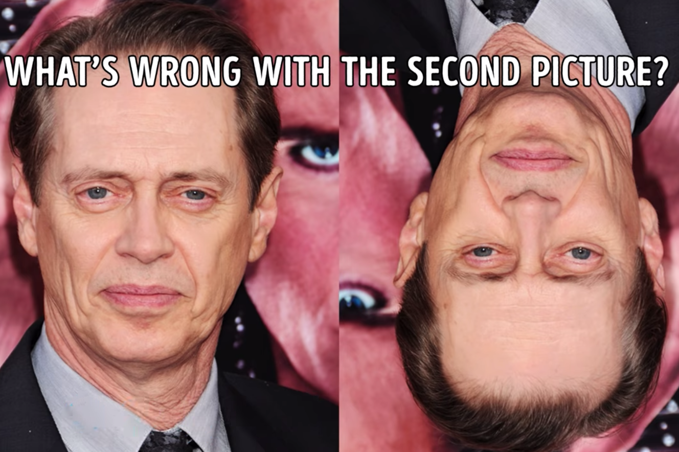
Students discussed a series of images in terms of aspects of the reading that were relevant to how we perceived the images (see https://www.youtube.com/watch?v=llLVk2fqylA):

We ended the class contemplating another visual effect as highlighted in https://www.youtube.com/watch?v=VT9i99D_9gI.
Job #1 of our visual system is to scan our surroundings for what we need for survival: not bump into objects, find food, spot dangers.
Then we gather and interpret the light that reaches our eyes (for additional interesting content). Without our attention, we miss a lot. We can pursue an active exploration — the outpost for our brain. Perception starts here.
Visual structures can be consciously organized and put together — the systematic manipulation of graphic elements and forms influence the way we perceive them.
Suggestion can make us believe we see something we couldn't (e.g. a newspaper headline too far away).
Fibonacci sequence (...3,5,8,13...) seems to align with our ability to notice increases in light (using an experiment of adding candles).
An experience has a quality that is different from the parts — relationships dominate perception (and order matters)
art v. science is commonly simplified to emotion v. intellect, but that reduction is not completely accurate.
The simplicity principle (see the boy in figure 2.3)
We simplify what we see through:
- shape
- differentiating
- grouping
- removing noise or 'junk'
And we have visual biases:
- dot in center v visual center (fighting gravity)
- perceived movement and tension (gamma motion)
- a shape pointing in a direction seems to move in that direction
- perpendicular axes suggest rest —
  diagonal suggests movement (unless balanced like an X)
- closure
- connecting the dots (cubism)
- repeatable shapes (to help memory)
- symmetry
- contrast with surroundings
When a visual feature is slight but different from our bias, we tend to apply two processes to it:
- leveling (removing the minor difference as if it didn't exist)
- sharpening (exaggerating the difference to make more obvious)
Useful in this class to learn visual styles that create an overall movement (to present currents, wind, fronts)
Figure v. Ground v. Depth (figure-ground differentiation is pursued first in our visual scanning)
sense of depth comes from the contrast of figure and ground (more contrast in brightness or hue (or texture or size), the more the depth effect) (important for font design)
chromatic aberration gives the illusion of colors taking up different positions in space, with red being in front, and blue being behind.
- lines together suggest figure (apart suggest ground)
- convex shapes make better figures (concave can look hollow)
- lots of texture suggests a figure
- certain shapes can vacillate between figure and ground (like cubes)
- ground is the more stable element (parallax effect)
perspective can be provided via a vanishing point (v. isometric - where parallel lines stay parallel)
vanishing points can invite us in while isometric can suggest we keep out
figure-ground can provide an intense 3-D effect and/or is useful for measurability
Bruce then started a discussion regarding color and how we see it and asked students to suggest relevant notes on color theory:
Hornung's Seeing Color
Tufte's Chapter 3
Zwimpfer's Color Light Sight Sense
Laidlaw's Visualization Viewpoint
Relevant notes from the Tufte reference include:
Humans have been shown to recognize 1,000,000 different colors in contrived situations, but 20,000 is realistic in day-to-day experience.
After 20-30 colors, we experience diminishing returns and even negative returns on occasion. The color brewer is a popular tool for making informatics coloring decisions.
color provides four purposes: to label, to measure (as in charts), to represent, and to decorate
- use bright colors sparingly to distinguish attention
  (don't draw it to unwanted areas)
- keep bright colors apart (avoid blending with white)
- use muted backgrounds
  (and large areas — midrange grey very useful)
- good use of labels versus too much color highlighting
  (reinforce each other when attention is warranted)
- use same color palette if two different zones in an image
- the human brain gives considerable weight to contours
Useful to get an instinct for the hue-value-saturation approach to definint/representing colors (compared to the RGB we use for lighted displays)
use colors found in nature (especially those on the lighter side) - familiar and harmonic
Students discussed a series of images in terms of aspects of the reading that were relevant to how we perceived the images (see https://www.youtube.com/watch?v=llLVk2fqylA):


We ended the class contemplating another visual effect as highlighted in https://www.youtube.com/watch?v=VT9i99D_9gI.

