

Class on April 8 2019
Data representations and transformations
We started off with an interactive lecture reviewing what we have done together so far in pursuit of gaining insight into a visualization pipeline process:Bruce reminded the students that our #1 goal for the course is to get some familiarity with the data visualization pipeline:
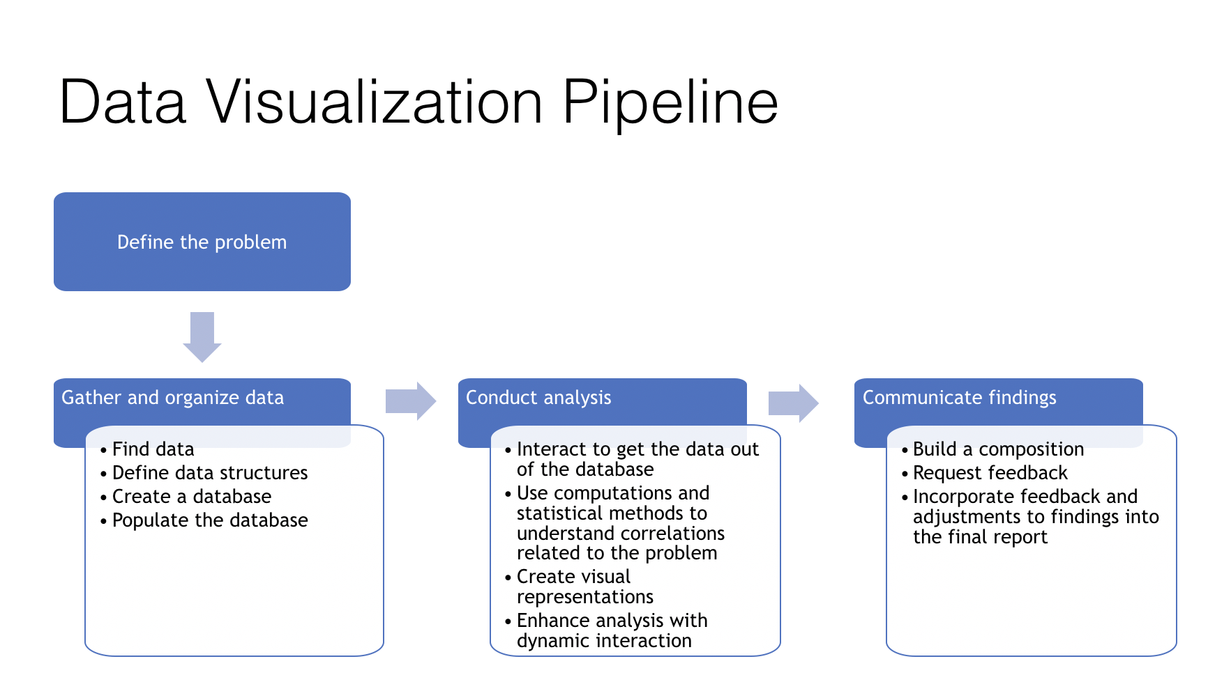
Cindy generated the above image for inclusion in our notes. Bruce pointed out that there is a PODS taxonomy that could make suggestions for sub-dividing the steps (especially by using the upper-right quadrant of the taxonomy)
We've doing looking at steps in the pipeline in relative isolation so far, but the goal is for students to gain experience through two projects. The first is a climate change analysis project. The second is a project of their own choosing.
The previous four weeks included example work on each of the pipeline steps:
Collect/Find Data — students helped find interesting climate data to add to the list of data Bruce found on our behalf. Those were included as a series of .csv files in the week5.zip archive. They come from various references to interesting climate change documents online.
Create a database — students did this from a data model for a climate change analysis similarly to how we created the restaurant data model.
Populate the database — we populated our climate change analysis database with the data we found as a class to fill out the model we created. We studied the restaurant.sql file and how it populated the restaurant database we did together in class.
Interact to get data out — we wrote some queries to get relevant climate data out of the climate database. Each question we came up with can have specific data to support pursuing an answer. We first worked on how we do this with the restaurant database. Bruce provided a primer we went over together in class this week (at the bottom here).
Computation (aggregation, sort, filter, etc.) - we discussed the computation necessary to answer our climate questions. Bruce provided some examples in a Python notebook that is part of the week5 archive that we went over in class.
Create a visual representation — Bruce created three visualizations we can use as examples of how we might want to do this. We went over them and flushed out some descriptions on the bottom half of this page.
Build a composition — we discussed composition through some examples Bruce provided and discussed favorite examples students had seen online. One river system water quantity composition example that Bruce created professionally is documented here.
Add dynamic interaction — is also represented by examples such as the river system water quantity analytical example.
Request feedback (critique) — we will perform our own critique on the examples we see in class, but then students will have a chance to pursue your own based on the two projects we are working on.